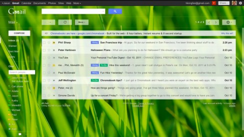
A leaked Gmail preview video shows-off its new cleaner interface and some additional product features that users can expect in the near future. The video features Jason Cornwell, a user experience designer on Gmail, who talks about Gmail’s major upcoming changes.
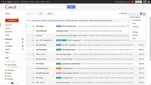
The new “modern look” interface is very similar to the two Gmail preview themes released during the summer, both of which can be applied by following this guide. As promised, the new Gmail dynamically adapts to fit users’ screen sizes, as the variation of device displays continues to grow. The display density can be changed from Comfortable, to Cozy or Compact to keep novice and power-users alike content.
“We’ve completely redesigned the look and feel of Gmail to make it as clean, simple and intuitive as possible.”
The size of the Label and Chat areas are now adjustable so users can give precedence to one or the other if preferred. Many of the existing Gmail themes have been updated with new high-resolution imagery, allowing them to “really shine”.
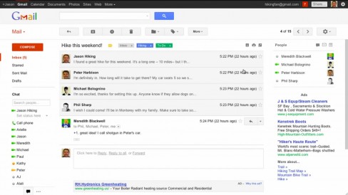
Conversation or Chats in Gmail have also underwent a major redesign – functioning more like Facebook Messages some have commented. Conversation readability has improved and profile pictures help users quickly establish who said what.
Perhaps the most important feature upgrade can be found in Gmail search. A new search box allows users to easily customise their search and quickly apply advanced parameters like email source or destination, or specify a time-frame or subject and message keywords. The new search box also allows filters to be created without leaving the current view in Gmail.
No official word has been given as to when we can expect the new look Gmail to be rolled out. However, In July its roll-out was described as “months” away, and with this promotional video being uploaded to YouTube by Google and its status subsequently changed to private (not before somebody downloaded and re-shared), we should expect it fairly soon.


