Following on from Google’s launch of mobile-friendly labels in mobile search results last November, Google will now begin to use mobile-friendliness as a ranking signal come April 21. So after that date if you’re searching on mobile, Google is more likely to return mobile-friendly results in search. What this means for webmasters is that now – more so than ever – it’s important to optimise for mobile.
Mobile-friendliness is not just measured in terms of having a responsive website or not having one. Your responsive website must also be usable to be considered mobile-friendly by Google. Google uses the following criteria to measure mobile usability; content resizes so user does not have to scroll horizontally, enough padding around links in close proximity so the correct one can be easily tapped, text is readable without zooming, and mobile-unfriendly software like Flash is not used.
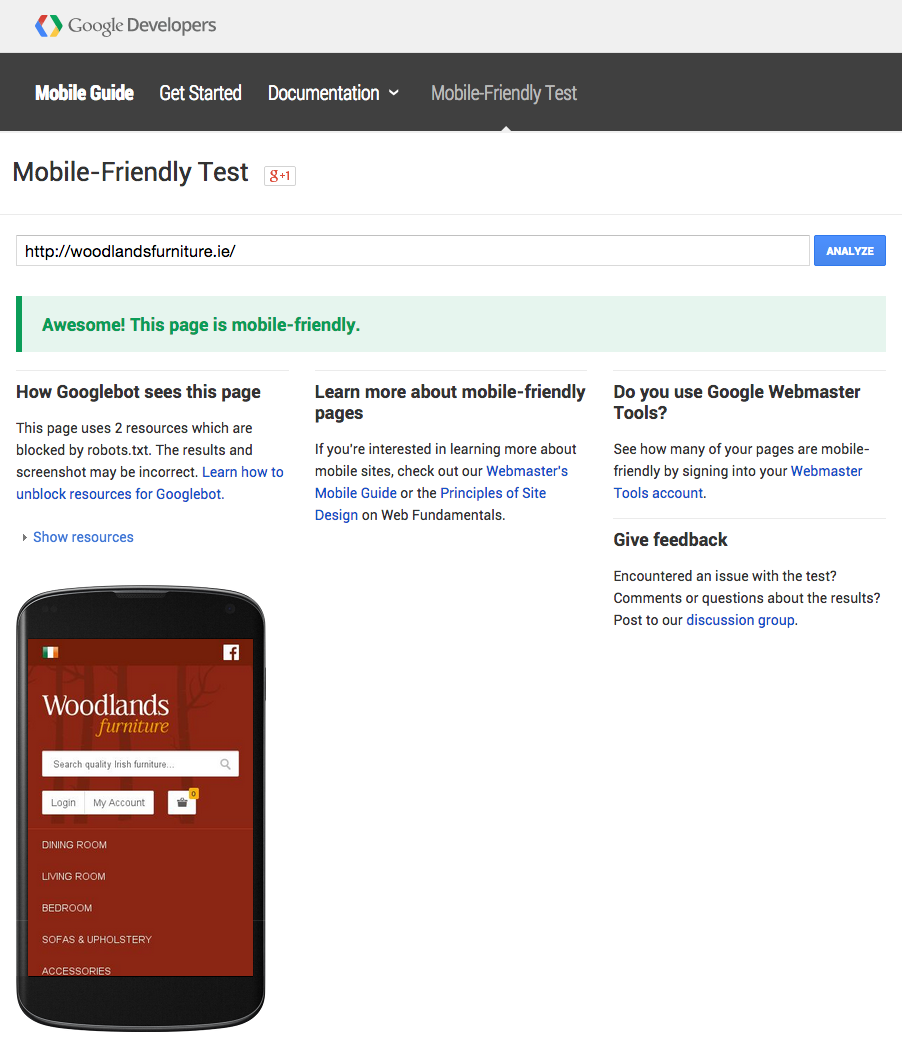
Google has two very helpful tools to test for mobile-friendliness. If your website has ANY mobile usability issues it won’t be labelled as mobile-friendly in search and will not benefit from Google’s search algorithm update in favour of mobile on April 21. The first tool is Google’s Mobile-Friendly Test and the second a Mobile Usability Report inside Google Webmaster Tools. The good thing about the latter report is that it analyses mobile usability across your entire website and not just one single page.
Each report gives a list of items that need attention (if any) and advice on how to resolve. You can read some great tap target guidelines here or for something more general Google’s fundamentals of building for the Web.