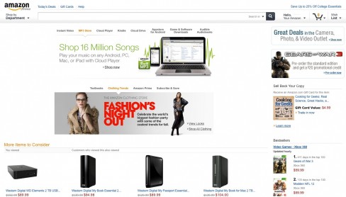
Amazon has confirmed that it is in the process of testing a “major” redesign of its website, the first such design change since September 2007. From a screenshot that we’ve seen, it looks like the site version will be cleaner and contain less navigational elements like category hover states, making it more accessible to tablet devices.
The new site version is said to be appearing for some Amazon users, although its unclear what criteria determines its advent. Amazon aren’t willing to reveal when the new design will be rolled out globally either, stating that they “can’t speculate on when the new design will be live for everyone” in an interview with the Wall Street Journal.
The new design will keep some of the branding elements that we’ve become accustomed to since the world’s largest online retailer first launched its website in 1995, including the orange and blue colour branding, as well as the large search box.
News of Amazon’s tablet-tailored design comes amid speculation of their $250 7-inch tablet, expected to begin retailing in time for Christmas. Tech Crunch’s MG Siegler claims that the tablet runs an Amazon-skinned version of Android, referring to the interface as “black, dark blue, and a bunch of orange”.
There’s so much Amazon influence on the device’s OS in fact, that there’s not a single reference to the Android Market app, or other pre-installed Google apps, like Gmail, for that matter. It’s also possible that Amazon are able to offer the device so cheaply as users are likely to use other Amazon services so deeply integrated into the tablet. The music app is Amazon’s Cloud Player, movie app their Instant Video player, book reader is the Kindle app, and the app store is Amazon’s Android Appstore.
The tablet’s anticipated release date is certainly before the end of November, by which time Amazon’s tablet-friendly website should be available to all.