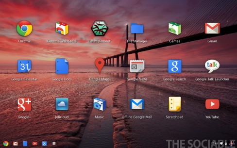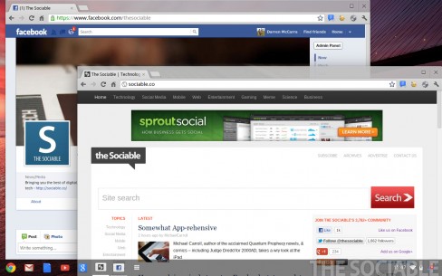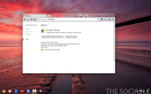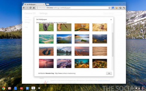
Chrome OS, Google’s open-source operating system developed solely for the purpose of running web applications, has gotten its first major interface redesign since public launch in June of last year.
As with any new project undertaken by Google we’ve been following along attentively. While Chrome OS doesn’t appear to have garnered any real traction yet, it’s still early days and it’s obvious with this update that Google still has very real plans for the platform.
The latest build, only available through Chrome OS’s developer channel, looks more like a traditional desktop than its previous browser-only presentation.
Chrome OS now has a new window manager known as Aura, a quick launch bar called Shelf and a feature that lays-out applications in familiar Launchpad-like format.


Other welcome features include the ability to set desktop wallpapers, transparent overlapping windows and support for tar, gz and bzip2 file formats.

The new version of Chrome OS feels less limited than its predecessor, but it’s no replacement for a traditional laptop.
So where does Android come in? Both Android and Chrome OS are growing more and more in convergence, similar to the way Mac OS X and iOS are merging, interface wise at least.
Can anyone else recognise a hint of Ice Cream Sandwich now in Chrome OS or is that just me?
Not really that odd, users couldn’t wrap their head around the concept of the browser being the only GUI. Adding a taskbar and windowing moves it closer to being accepted by the masses as a viable home/enterprise desktop environment, given that’s what they’re familiar with.
Not really that odd, users couldn’t wrap their head around the concept of the browser being the only GUI. Adding a taskbar and windowing moves it closer to being accepted by the masses as a viable home/enterprise desktop environment, given that’s what they’re familiar with.
It is nice to have that base layer to fall back to, adds perspective
It is nice to have that base layer to fall back to, adds perspective