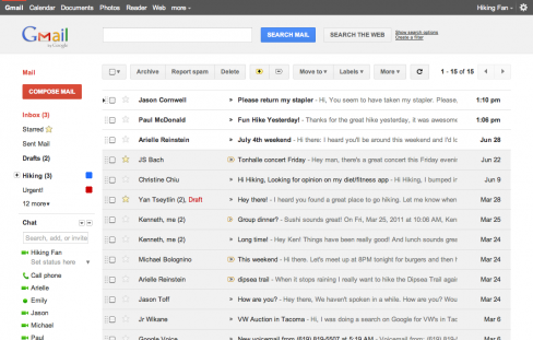
As part of Google’s intensified efforts over the past week to unify user experience across it’s products, as we’ve seen with user interface (UI) updates to Google Search, Google Calendar and the introduction of Google+ this week, Google will roll-out a new unified interface update to Gmail in the coming months.
Jason Cornwell, user experience designer at Google, explains how the interface update is “part of a Google-wide effort” to bring users a consistent experience that’s more “focused, elastic, and effortless” across all of their products. The new design will “help strip out unnecessary clutter and make Gmail as beautiful as it is powerful”.

Google also state that the new “modern look” interface will “expand dynamically” to accommodate varying screen sizes and user preferences. For those of you, like myself, who do not wish to wait “months” for the improved interface to be introduced, Google have provided two sneak peek themes that carry all the major changes made to date.
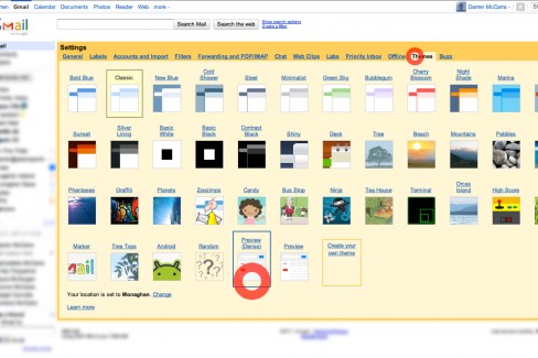
How to apply the sneak peek themes
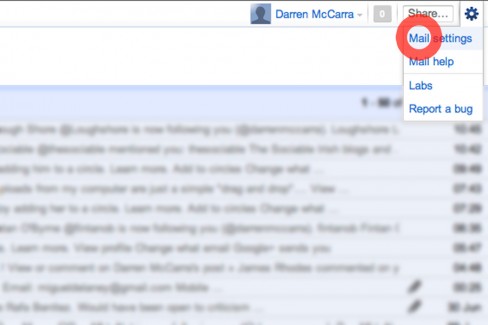
There are two sneak peek themes available; ‘Preview’ and ‘Preview (Dense)’. Personally I prefer ‘Preview (Dense)’ as it’s more derivative of the classic Gmail theme. To apply either theme simply click Mail Settings in the top right-hand corner of your Gmail window. Under the Theme tab, select either preview theme you which to apply.


Really think this is still not dense enough, even on the ‘dense’ setting.
If you compare it to the original themes everything seems to be so much wider with significantly more whitespace. I just feel like I’m doing less with my time.
Really think this is still not dense enough, even on the ‘dense’ setting.
If you compare it to the original themes everything seems to be so much wider with significantly more whitespace. I just feel like I’m doing less with my time.
@MattieTK Agreed. Too much vertical spacing in my opinion. Might not bode well with power users?
@MattieTK Agreed. Too much vertical spacing in my opinion. Might not bode well with power users?
I like the new look of gmail actually, except I don’t see the black bar on the top on new themes.
I like the new look of gmail actually, except I don’t see the black bar on the top on new themes.