Google’s company-wide efforts to unify design and user experience across all products show no signs of abating as Google this evening introduced another tablet friendly update to Google Search.
After Google’s initial tablet experience overhaul back in July of this year to their flagship product, today’s tweaks are minor, but welcome, in comparison.
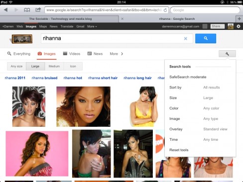
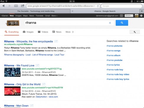
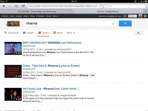
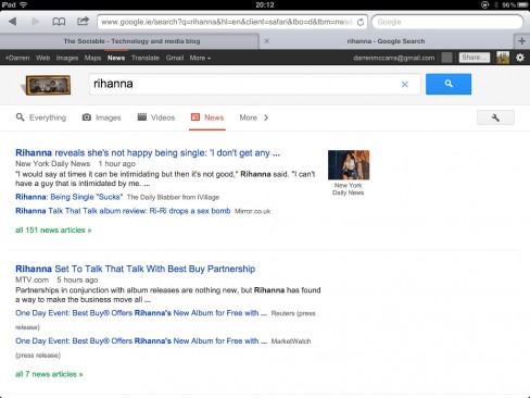
Images, Videos and News filters are now immediately accessible above search results using tablet-friendly chunky buttons. A ‘More’ button reveals less-common filters Books, Blogs, Discussions and Patents.
Depending on what filters are applied, a Search tools icon reveals various applicable search parameters like Time, Colour (image), Size (image), Duration (video), Quality (video) and so on. Previously, these parameters were accessible through individual drop-down menus. Perhaps they were not as widely used as expected?
The new design is currently only confirmed as being served to users of Apple’s iPad, but it’s extremely likely that Android tablet users will experience the update also.
Is the new design tweak live for you? Let us know in the comments. Meanwhile, here’s a few screenshots of the changes you can expect.


